
Showing posts with label book design. Show all posts

Tuesday, March 19, 2019

Celebrating Pretty Books

by J.M. Phillippe


There is nothing quite like seeing your book in print for the first time. I adore eBooks, and am just as thrilled when someone buys a digital version of my books as when they buy a print one, but actually seeing my books in print does something to me that seeing it digitally just doesn't do. In print, it's tangible, solid. My first memories of books were of course the print kind, and seeing my words as I flip through the pages feels magical.
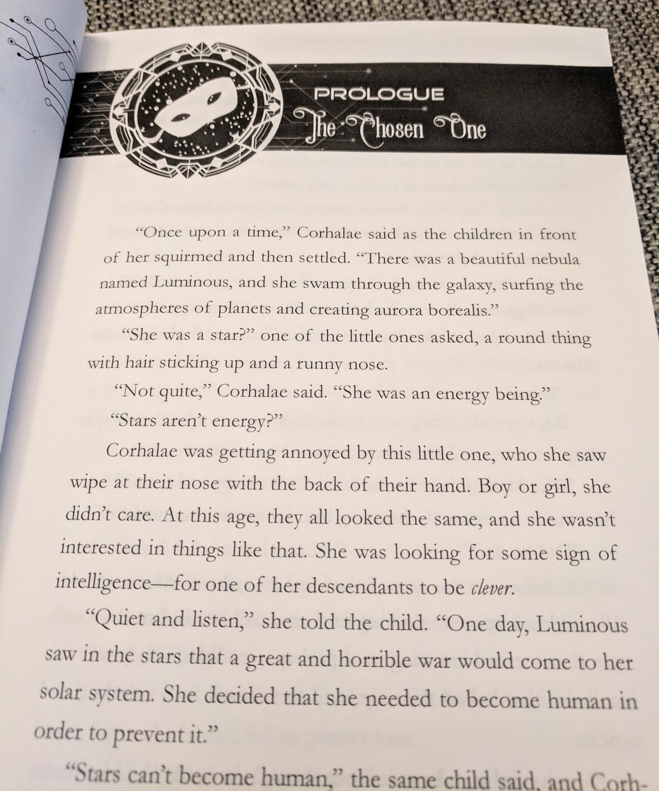
I am particularly excited because today, the print version of my latest book, The Glitter of Gold, a space age retelling of Rumpelstiltskin and part of the Galactic Dreams Volume 2 boxed set, is being released, and I can't wait for folks to see it because the inside is just so pretty!

 I love all the details inside the book, from the font choices to the additional little illustrations found in the section and chapter headings. A quality design can really add something to the way a reader experiences a book, and I am super excited for the experience that readers will have with this book.

Maybe Bookstagram (taking pretty photos of books for Instagram or other social media) has made me even more aware of just how pretty books can be, but lately I have been thrilled to see what designers are doing to help add to the experience of readers investing money (and shelf space!) on print editions.

So here's to pretty books -- may the stories they contain be just as memorable!

***

J.M. Phillippe is the author of the novels Perfect Likeness and The Christmas Spirit, the sci-fairy tales Aurora One and The Glitter of Gold (part of the Galactic Dreams boxed sets) and the short stories The Sight and Plane Signals. She has lived in the deserts of California, the suburbs of Seattle, and the mad rush of New York City. She works as a clinical social worker in Brooklyn, New York and spends her free time binge-watching quality TV, drinking cider with amazing friends, and learning the art of radical self-acceptance, one day at a time.


Tuesday, March 22, 2016

Digital Publishing


By Bethany Maines

Recently, I’ve been learning about the nitty gritty “how-to” of e-publishing.  While there are many how-to’s on how to put your story up for sale in the virtual marketplace, learning how to make an epub file is a lot more difficult and confusing. 

As someone trained in how to make print books, this status is infuriating to me.  I can make words magically appear on paper – why is the screen any more difficult?  But as it turns out epub formatting is more akin to website programming than to traditional book design.  Both epub and websites must account for the fact that the designer can never be certain on what or how the end user will view their product.  Will it be on a phone, a tablet, or a desktop screen?  Will it be a horizontal or vertical?  Which operating system will be accessing the file?  All of these factors play into how an e-book is seen and creating a file that can be used in ANY format means that many of the traditional design elements beloved by graphic designers, such as color, size, and forced white space, must be set aside. Learning to create an epub is a bit like feeding content into a slot in the wall, letting the machine in the next room whir away, and then trying to guess how the machine works by looking at the book it produces.

In the last few years website programming has experienced a burst of development that can make creating a website an almost drag and drop, WYSISWYG experience.  Meanwhile, digital publishing lags behind, still in it’s infancy. 

Take a look at these images of the first page of my third Carrie Mae Mystery novel, High-Caliber Concealer.  One is a screen cap from a mobile phone kindle app and the other is a photo of the printed book.

You’ll notice several differences – the large area of white space before the chapter title is gone and the fonts are not the same.  Fonts in epub’s must utilize a websafe font or embed the font within the file.  But, not all devices recognize embedded fonts, and they make a file larger and some platforms take a percentage out of an author’s royalty based on download size (you’re hogging space on their server).

However, there are some similarities that the programmer managed to achieve.  Notice how the gap between “Brunch” and “Mexico” mimics the print version?  And you’ll see that while the font isn’t the same, the font hierarchy and general sizing of the chapter information is the same as the print version. 

And beyond the appearance of words on a screen there is the tricky business of making all the chapters appear in the right order and having a hyper-linked (click and go) table of contents that allow readers to navigate easily through the book. 


No digital book is as simple as a word doc you type at home.  So if you see a well-crafted book on your e-reading device, take a moment to appreciate the book programmer!  

***


Bethany Maines is the author of the Carrie Mae Mysteries, Tales from the City of Destiny and An Unseen Current.  You can also view the Carrie Mae youtube video or catch up with her on Twitter and Facebook.